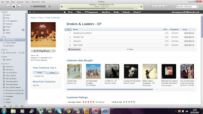
Advertisment and promotion is what ultimately sells our product and whilst designing our digipak we have had this in mind. We analysed the bands original digipak and then we compared it with ours and drew parellels and differences with it and we believe we have made an effective digipak that reflects the bands ethos as well as the music video we have made for one of the tracks on the album, 'weather girl.'
This is the original EP for polar collective, as you can see they are on itunes as a form of advertising and promotion which is the most popular music download station currently. The actual front cover of the EP itself is of a sepia colouration with various miniature toys scattered over a table with the band behind it. The colour of the EP suggests a vintage feel as well as the various props which bring a sense of quirkiness to the front cover. This is important as their target audience will be engaged by this as their audience will be young teens who enjoy indie/pop music therefore something far from mainstream and something more quirky. We have taken inspiration from this for our digipak as we wanted to go for the quirky feel also as well as bringing some vintage aspects to it also, as we know this is what will attract our target audience. However for our own individual front cover we have focused more on Goodwins star image and bringing a sense of vibrancy to it as we wanted it to fully stand out.
As you can see above we believe we have achieved this look, bringing a sense of quirkiness, colour and simplicity to our digipak. We also believe this will definitely appeal to our target audience as it is some what similar to the original cover however brings a different aspect to it of star image and colour.


No comments:
Post a Comment