Sunday 30 December 2012

Original Digipak Idea;

Whilst brainstorming for digipak ideas we went through our un-used footage in order to spark our creativity and really nail the artists aesthetic in order to bring this to the album. We knew we wanted something quirky in order to engage our target audience but we also wanted something that fits in nicely with the indie/pop theme therefore bringing in colour as well as star image. Whilst stumbling across our footage we found this an print screened it in order to annatate it.

As you can see this image that we captured is bright, fun, quirky but not yet refined. So we took ideas from it and adapted it to our final digipak cover. What we picked out from this picture is the fact sam is sitting in the bath with his clothes on, we took this idea and adapted it as we thought it was quirky and different and had a house-party young adult feel. We also took the idea of having the rubber ducks in shot as it creates a really fun aesthetic as well as being quirky and bringing vibrancy to the shot; as utimately we wanted to create a bright, fun and quirky digipak.

The negatives that we picked out from the shot is all the uneccessary props in the background that make the mise en scene look moderately messy. Therefore in our final digipak we removed these to create a more thought out look. Also we realised the bottom of the ducks are cut out of the shot so we wanted to make sure we got them fully in, in the final shot just to make it look more professional and planned. Moreover we ditched the umbrella as we thought it make the shot look too cluttered and we wanted to keep it simplistic and fun, rather than it looking too messy. Overall this shot really inspired our final digipak album cover, therefore we realised the importance of brainstorming and looking over older footage in order to get inspiration and spark our creativity to create something fun and quirky which will engage our target audience.

This is our digipak image and as you can see there has been vast progression from our original idea, such as the lighting, the overall mise en scene and how we portray the star image.

Thursday 27 December 2012

Our use of a mobile phone in our music video;

When we were constructing our music video we knew we wanted to have a section of it purely showing a mobile phone texting/tweeting and facebooking in order to portray a sense of modernism as well as keeping the theme of quirkiness; adding a fun twist with tweeting the actual band. Originally we were not sure how we were going to add this to our video whilst achieveing continuity however we realised it would be a 'cool' idea to text/tweet and facebook the lyrics of the song whilst it was playing (kind of like lip syncing.)

To make our use of a mobile phone even more effective we decided to sync the writing with the rapping part of the song...

'you dress for the weather i dress to impress her.'  - we purposely used as a text message because we wanted to make the lyric more personal, like the artist is texting his friend, devoting his love for the weather girl.

'channel 4 is the home of the best girl in britain.' - this next lyric, we tweeted on to the actual polar collective twitter page in order to advertise the band as well as to engage the audience to add a suprise to our video. Twitter is also a conventional social media site in which participants make bold statements, therefore we thought this lyric was appropriate for twitter.

'This song was written to express my feelings and im feeling quite smitten so im gonna take a minute.' - this is the final lyric that we filmed posting on facebook. The reason we posted this on facebook is because it was the longer lyric which fitted in with facebook well, as well as conventionally, facebookers put quotes on their homepage therefore we thought this lyric was appropriate.

Overall our use of a mobile phone worked really well in our particular music video as it followed the contuinity of bringing a sense of quirkiness to our video alongside technology and modern advertisment which is used specifically by our target audience, young adults. We believe this section of our music video will be popular with our target audience as it is familiar to them, also it shows how they can become closer with the artist/musician as they can follow them on twitter, moreover we used a blackberry which next to the iphone is the most subscribed phone in 2012 with people aged between 13-19.

Above is a screenshot from our specific music video when we were filming typing the lyrics on to twitter. As you can see the main words which stand out are 'Whats happening' , that being a young/hip phrase which attracts our target audience. Furthermore above is the official polar collective twitter page which engages the audience fully as now they are aware they can follow them on twitter as well as the artists being more relatable to their audience.

Throughout the editing process we used the speed up tool 'Ctrl -J' on final cut pro and sped it up by 150%, we did so in order to sync the typing with the actual lyrics in order to create a professional look as well as to encourage the audience to be able to sing along.

Advertising/ DigiPak;

Advertisment and promotion is what ultimately sells our product and whilst designing our digipak we have had this in mind. We analysed the bands original digipak and then we compared it with ours and drew parellels and differences with it and we believe we have made an effective digipak that reflects the bands ethos as well as the music video we have made for one of the tracks on the album, 'weather girl.'


This is the original EP for polar collective, as you can see they are on itunes as a form of advertising and promotion which is the most popular music download station currently. The actual front cover of the EP itself  is of a sepia colouration with various miniature toys scattered over a table with the band behind it. The colour of the EP suggests a vintage feel as well as the various props which bring a sense of quirkiness to the front cover. This is important as their target audience will be engaged by this as their audience will be young teens who enjoy indie/pop music therefore something far from mainstream and something more quirky. We have taken inspiration from this for our digipak as we wanted to go for the quirky feel also as well as bringing some vintage aspects to it also, as we know this is what will attract our target audience. However for our own individual front cover we have focused more on Goodwins star image and bringing a sense of vibrancy to it as we wanted it to fully stand out.

As you can see above we believe we have achieved this look, bringing a sense of quirkiness, colour and simplicity to our digipak. We also believe this will definitely appeal to our target audience as it is some what similar to the original cover however brings a different aspect to it of star image and colour.

Thursday 20 December 2012

Digi Pak Photos;

Yesterday me and sam went to shoot some pictures for our digipak. We had a firm idea in mind of the pictures having a house party feel to them therefore shooting in sams house with some additional props of a guitar, rubber ducks and beer bottles. We chose these specific props as we wanted to really focus on the quirky look we are going for throughout the music video as well as our album cover. We had the key idea of using silly string within our shots and we kept this in mind, and when we covered the guitar in it it achieved a really effective shot, highlighting the party feel that we hope our album will be all about. After editing I watered the pictures down to having 4 really effective ones, the album cover itself, the back cover and 2 other images that I hope to use within the album.

This is the image we chose for the album cover. As an album cover we thought this shot was really effective as it has been lit rather well, with a 2 point lighting system, it also employs the rule of thirds as well as being a nice photo of sam, enhancing the star image. The ducks are significant within the shot as it brings that quirky feel we were after as well as bringing some vibrant colour to the shot. To edit this shot i used a free editing programme and after playing around with the different functions i came up with this effect. As it has a vintage, polaroid look to it this highlights the quirkiness as well as attracting our target audience as the vintage look is in fashion currently. The font is still in a working progress as it is what we are looking for, something quirky and cartoon like however i believe we could make it stand out even more, and to do this I was thinking about putting the font in seperate boxes, enhancing the animated look as well as making it stand out even more than it does already.


This is the image we constructed and chose for the back of our album. This image really epitomises the house party feel with the rustic guitar covered in silly string with beer bottles staggered over the shot. Like the front cover shot it has been lit from above with 2 lights pointing to the guitar from different directions, this has created a vibrant image with the guitar stickers jumping off the shot in contrast to the wooden floor which gives the shot a 'basement feel' to it. We wanted our album to have a sense of continuity to it therefore i chose the same font for the back cover as well as the front cover. To highlight the text i chose to differentiate between black and white as well as putting a cartoon cloud in the top right hand corner, bringing another aspect of quirkiness to the shot as well as referring to our music video.


This is another shot that we want to include within our digipak,maybe as the inside cover however we are not sure yet. Likewise this picture brings a sense of contuinity to our digipak, linking to the front cover of our shot. What makes this shot so effective is the use of leading lines, the front duck being in complete focus whereas the last duck seems to be a bit blurred, i believe this really works as there is also a hidden duck in the background bringing another element of quirkiness and fun to our digipak. I edited this shot on the same editing programme however used a different effect, which really enhances the vintage look of the shot. I believe this would work as an inside cover as it doesnt have sam in it therefore focusing the audience's attention on the front cover yet it is still a dynamic image which is engaging and quirky.


This is the final image that we chose for our digipak to use as one of the inside shots. It conveys sam as a party animal with silly string thrown all over him as well as his guitar.. also he is holding a beer bottle which highlights the house party feel we were going for. Likewise sam's facial expression is very neutral therefore showing no emotion, which is conventional with young adults, our target audience. We believe our digipak will engage our target audience as it is fun and quirky yet is still made up of effective shots that conveys sam's star image.

Tuesday 18 December 2012

Filming in the Studio:

On tuesday we reviewed our music video and what we needed to do in order to complete our final first draft. We realised that in order to get a wide range of shots and to fill up minor gaps in our video we needed to film more, and we had the idea of filming in a professional studio in order to achieve the performance aspect for our video. We also decided to film a section of our video in a studio as it is conventional for the indie theme as it shows musical raw talent, which is emphasised by the lighting and body language of the artist.

The studio consisted of a dark grey/black screen and we had 2 high key lights pointing towards Sam from both the left and right direction. We did this in order to light up the whole of sam to achieve a flawless image as well as to contrast with the dark screen; we were not sure if this was going to work but when we filmed several shots we realised it did work and did achieve a professional look as well as having a  music video feel to it, especially for the indie genre.

Filming in the studio enhances the musically raw element to our music video and therefore engages our target audience, of young/indie adults that appreciate musical talent as well as a quirky twist.

Our Text Editing

This is an example of the text we have recently edited over the top of our footage in a certain part of our song. We decided to do so as we believe it enhances the quirky look of our music video as well as bringing a literal meaning to it. In the song a different singer sings 'youre not dating her' therefore instead of getting someone else to perform we had the idea of putting text over the footage. In order to get the text on to our screen, we searched dafont.com to find the perfect font for our particular music video. We knew we wanted something almost cartoony as the song has a real animated feel to it, therefore we wanted to mirror this in our editing.

We decided to layer up the text in order for it to appear on the screen seperately when each lyric was sung. This was quite time consuming as we had to almost edit it like we would lip syncing, however after we did so, we were so happy with the result as we achieved the perfect timing as well as a clear link between the lyrics and the video.

Tuesday 11 December 2012

In depth research; Digipak

As we have now decided what images we want to create for our digipak i have down some more in depth research about similar digipak's that i have found online, that contain the same imagery as ours. So a man with a guitar, certain similar locations and mise en scene. The reason for doing this is so i can grasp a better understanding of the conventions within the music industry in which sort of album cover appeals to a certain target audience. Therefore for our particular album we wanted to create a conventional album, a man with his guitar however we want to bring our own quirky twist by using some unique imagery alongside it, for example we are planning on covering our artist and location in silly string which will hopefully create a quirky and dynamic image.

This is the first album cover that i have analysed in order to get a better understanding of the type of digi pak we want to produce. This is similar to what we want to produce as the main  focus of the cover is the artist with his guitar and this is what we want to achieve however we want to employ the rule of thirds to create a better looking shot. Furthermore the constructor of this album has played around with saturation and different colourations, we also want to do this, however we want to desaturate our cover a little bit rather than to create a yellow tone, we want to desaturate ours a little bit in order to create a more moody atmosphere, this will be popular with our target audience as it will have a serious, musical feel to it as well as a quirky twist alongside it.


This is an example i found of an ed sheeran image which is similar to the type of shot we want to create for our digi pak cover. The location is what stands out in terms of what we want to use for our digi pak, Ed is sitting on a bench which is a conventional setting for a songwriters album, as it shows their humility as well as portraying their raw talent through the raw location of a bench. However we want to create a different shot to this one as we want to use the rule of thirds and leading lines to enhance our image further, this will focus our target audience's eyes on to our artist and his guitar, which is ultimately the most important thing. 


DigiPak: Focusing on main idea

Throughout the past week we have been brainstorming digi pak ideas and what we want our album to achieve, looks wise in order to engage our target audience. After much deliberation we have decided on a range of shots to include within our digipak. As we are aware this digipak will be to promote an album rather than a single so therefore we have decided to deter from using imagery from our actual music video, rather that we are going to go a completely different route, focusing on sam (the artist) with his guitar. However, althought we want to stick to the generic conventions we also want to add our own quirky twist as the band itself is very quirky and different therefore we want their album to directly portray that.

For the front cover of our digi pak we have come up with an exact image that we want to create. We want to use the rule of thirds alongside a mid-close up with sam sitting on the bench with his guitar. You may say this sounds generic however to add a quirky twist we are going to cover him with silly string, which as i have seen before, creates an engaging and effective image, as the colours stand out as well as the fact sam is with his guitar, highlighting that he is in fact a musician.

The picture above is an example of the type of image we want to create. The colour saturation is also similar to what we want to create. We want to achieve an engaging look with the multicolours of our silly string however we do not want this to look too vibrant and over the top as we still want to emphasis sam's talent etc. This particular shot has used leading lines which is also what we want to achieve with one of our inside cover shots, as it focuses the stance of the artist with his guitar, portraying how the guitar is almost an extension of himself. This sort of image will engage our target audience as young adults appreciate the talent of playing the guitar, however quirkiness is currently in fashion, and as our album cover is going to portray this we believe our audience will be intrigued by this. As well as this our female audience will be engaged as sam is a male with a guitar which is often a desirable image towards young females.

For the Back cover we want to carry on the guitar theme however we want to mix it up a bit to keep the audience engaged as well as our album cover being coherant and continuous. The shot that we are hoping to capture on Thursday for the back of our album is sam walking away in a rural location with his guitar either on his back of standing up next to him, this emphasises the isolated location, fixating the audiences focus on sam. This image also conveys a literal meaning as the back cover of the album represents the end, and sam is walking away from his audience, emphasising how the album almost has an intimate gig- like feel to it. 0

Thursday 6 December 2012

6/12/12 - What we edited today

In today's lesson we uploaded the footage we filmed the other day and unfortunately it worked out that a mistake occured with the camera and none of our footage was what we wanted it to be, therefore we had to set out minds on to something else. However we have planned to re film on tuesday to film more lip syncing , a segment where sam is in the bath and some more scenes which include barbie; such as her doing snow angels in the snow, her sitting on the edge of a wall gazing at sam and her sunbathing.

As our footage was unable to be edited we focused on doing something else that we wanted to include in our video, making our lyrics come up on the screen by using a cool/quirky font. We were not sure how we were originally going to achieve this however after some  trials and tribulations we have managed to achieve what we wanted. Originally we were going to use photoshop to create our on screen lyrics however we realised that the same look can be achieved simply by using final cut pro itself. In order to get the font we wanted we went on to dafont.com and scrolled through the 'comic' section as we knew we wanted a 'cartoony' feel to our font/lyrics as this enhances the quirkiness of our video.

This is the font we chose to use 'que fontita' as we believe this would create the kind of look we were trying to achieve. The exact lyrics that come up whilst using this font is 'you're not dating her' we chose to put this bit of the song in fontasised lyrics as we believed it fully got the message across as well as creating a new dimension to our video. 

Friday 30 November 2012

Re-Filming:

Last lesson we made a unite decision that we had to refilm a snippet of our music video, this caused little hardship for a worthwhile result. Throughout our music video there are different scenes that have been jumped and mixed up within it in order to engage our audience and portray different locations as well as different situations. The specific area of our video that we decided to re-film was the bit were our star was playing his guitar in his bedroom. Originally the light was in a downwards position pointing up to sam which created an effective shot however we realised once we had edited it that this didnt fit in with the music video genre/convention that we were trying to portray (a pop/indie one) and rather that this sort of lighting would be found in a rock video or maybe even a thriller.

Therefore we decided to re film, in the same location, same mise en scene but with different lighting. Our location remained sam's bedroom and our mise en scene remained the same, scruffy bed sheets, worn guitar and sams outfit was a checkered shirt and jeans ( like before ).  However we completely changed our lighting set up to create a more vibrant/bright and a highly saturated look. We achieved this by using two soft lights, one covered with a soft box, the other with a white umbrella, we chose to cover the lights as it creates more of a soft/flawless image which enhances the artist and highlights his features. We positioned the lights in a conventional two point lighting system, one at a 45 degree angle at the left of sam and one at a 45 degree angle right of same, therefore the light hits his face from every angle creating a vibrant shot which looks professional. 

I personally am really happy that we decided to re film as the difference that the lighting has made is outstanding, it has made me realise how lighting is definitely a significant part of a music video, taking it from looking student-esque to professional. 


This is a tutorial that i found which really influenced my use of lighting within my own music video. It shows how no lighting can make the video look very amateur however when lighting is used correctly, in this case predominantly back lighting, how the video now looks professional and well constructed.

This is a print screen of the frame before professional lighting was added in a backlight 3 point lighting system.

This is the after shot when the lighting has been added. Evidently this makes the shot look more dynamic and gives an extra depth to it, creating shadows and lens flares which are the aspects which create a professional music video through the use of lighting.

Thursday 22 November 2012

Target Audience

Target audience is a severely significant aspect when constructing a music video as the main goal is to ultimately engage the audience as well as promoting and selling records to this group of people. In order to make a successful music video it must attract to a wide variety of people as this is what will result in selling the most records, that being both male and female as well as trying to reach out to all ages if possible. Taking this information into account we decided to choose a pop/indie upbeat track which we believe will engage a large population, accompanied by our vibrant music video that will appeal to young adults as well as anyone of any age that enjoys a fast/joyful track.

In order to have a large target audience and one which will be engaged through our music video we went through the process of surveying a group of media studies to see what they look for and enjoy in a music video. out of 20 students 13 said they like a music video with an upbeat atmosphere as well as a happy ending, 6 students said they liked a more sinister music video which conveyed a sense of realism and only 1 students said their favourite type of video was a conventional rap one, featuring sexualised women. Therefore our ideas of a pop/indie video went perfectly alongside the majority vote of a vibrant music video which promoted positivity.

Throughout the process of constructing our video we have kept in mind target audience continously as we highly recognise its signficance as the whole concept of making a music video is to promote the artist and their star image hoping the result will be lots of sales. Specifically for our music video we chose an indie pop track which will engage a young adult both male and female audience. Our inspiration for our video and what audience we wanted to attract was the same as the popular sic- com the inbetweeners and skins, as they both have a massive following who enjoy indie music as well as a fun, cheeky programme so we expect them to enjoy our music video also.

Props : Barbie's wedding dress

As we are creating pockets of stop motion within our music video we know that it is essential to construct different scenes in which our barbie can be in, in order to keep the audience engaged. Our newest piece of stop motion is barbie's wedding day as the song contains lyrics which state 'we are getting married in the morning' therefore we are going to film a piece of footage of her in a wedding dress either at a photoshoot or on her wedding day. We have decided to take the lyrics literally as one of Goodwins theories state that visual and lyrical matching is a key convention in creating an effective music video.

This is the wedding dress that we have found as a result of searching through sam's sisters barbie box. We have customized it by cutting the straps off as we believe this creates a more modern look therefore our target audience is more likely to relate.

This is a picture of barbie herself in her new wedding dress. As you can see in different to the previous pictures of her we have tidied her hair and made it look more 'wedding like' as we want to create a realistic scene. Throughout our filming in the stop motion setup box we had a red background in which really emphasised the whiteness of the dress and worked well with the 2 point lighting system that we constructed. Red also holds connotations of lust, passion and love which are three things that we want to illustrate within our music video in a fun and quirky way.

Filming outside: Lighting

Today we decided to film more for the bulk of our music video ( the last couple verses inbetween the chorus' ) we knew we wanted to film more of our barbie to put in to our video through the use of jump cuts and that switch between stop motion and reality i believe is an effective one, especially for an indie music video. We filmed our barbie sunbathing as we thought it would bring a sense of realism and voyeurism to our video, however the lighting deemed to be an issue.

At first we didn't think that the natural sunlight would be enough to achieve the brightness we wanted within the shot, however we tested it out with and without  a reflector. The difference was monumental as it made the footage instantly look more professional, as well as a next level of vibrancy and brightness. Specifically we positioned the reflector in a way that the direct sunlight would bounce off of it in order for it to shine brightly on our barbie (as well as the whole screen of shot.)

This is the look we were trying to achieve as we believe it is an effective way of adding a sense of realism to our barbie shots as well as adding a fun aspect to our video. As you can see the lighting on this shot is bright however there is a shadow created by the flower, in our shot it is complete brighness as were trying to achieve high/soft key lighting in which creates a flawless image. We also filmed other diverse scenes for our music video today.. we filmed a car scene in which our male protagonist was driving and as he glances to the passenger seat barbie is sitting there, we thought this created a fun atmosphere as well as targeting our audience as they will be young adults as well relishing in the novelty of driving. Furthermore we also filmed at a bus stop as we thought this ticked all the convention boxes for a music video. We filmed a classic shot of the camera man being on the opposite side of the right, panning from left to right however we also twisted this convention by filming various types of shots such as a pan up the body, constant camera movement, including the barbie a lot in order to enhance the sense of relationship between sam and the barbie.

This is the type of reflector that we used as the white/translucent cover creates a soft flawless image, also enhanced by the intensity of light also created from it. We believe that using a reflector whilst filming outside is essential as it does indeed create a flawless image and without it , it wouldn't have the same depth of shot and would lack professionalism.

Tuesday 20 November 2012

Editing: Colour Correction

Colour correction is a brilliant tool seen within the final cut pro programme which enables you to control the saturation, contrast and white balance of your clip. For our specific video this is vital in constructing the look we want to achieve, which is a vibrant, high contrast one. Specifically we used/will use the 3 way colour correcting tool which gives us even more control over the way our footage looks and will be percieved.


In my opinion this is a brilliant example of the way colour correction can really transform a piece of footage for the better. As you can see the three colour wheels on the left are what ultimately give you the full control over the saturation, white balance and contrast of the shot. When the saturation is altered this either emphasises or dampens the colour, eventually putting it into black and white. Whereas the white balance controls the lightness of the shot either making it washed out, which is what you would maybe use in creating a thriller or as in a music video case it can add real depth to the shot, creating a dynamic image. Furthermore the control that is possible over contrast is the most useful for our specific music video as this allows us to create vibrant, dynamic footage which almost takes on a cartoon feel which is what we are after in order to construct our quirky/indie music video. We are constantly using this helpful tool throughout our video as it emphasises our use of lighting which ultimately makes our footage look more professional as well as being well put together. Evidently within the image above, this tool is helpful in many ways, especially in emphasising the headlights of the car, making it look more powerful than it is, in addition to this it also gives the shot a 3d dynamic unlike the image before it was colour corrected. Editing using colour correction ultimately is to engage our target audience as it is apparrent that a more dynamic image creates more attention rather than just a plain 2d image which hasn't been edited. This is because our target audience of young adults are used to seeing dynamic imagery through the new tech films and music videos and that is why we want to achieve this look within our music video, and our answer to this is effective lighting and good use of colour correction.

Digi Pak Brainstorm

Here is a rough template for a traditional digipak design. It has four sides which are the front, back, inside cover and back inside cover, all of which are used to convey what the artist is all about as well as there star image whilst promoting their music. As you can see in the template, the image of the artist is present on all four sides as after all this is the most important thing that needs to be advertised, as the artists target audience want to see their star all over the album. As we must create specifically an album cover it is important that the digipak creates a sense of unity and formation to it in order for it to have a collective feel. Therefore i think the best way to do this is use similar shots of the artist throughout the digipak so it does create this feel. The font is also significant whilst creating a digipak as it can say alot about the genre of the artist and what they want to portray. In our case we are promoting an indie band that have a quirky look that goes alongside their music, therefore the font we were thinking of using for our digipak is a quirky yet simplistic one as that mirrors the band itself.

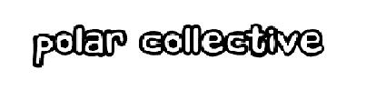
This is an example of the kind of font we were thinking of using for our album cover. I discovered a font website which offered a range of fonts and i believe this is the closest one to which we were looking for as it is almost comic/cartoon like however still has that quirky, contemporary look also. 

For the front cover of our digi pak we were thinking of taking some inspiration from our video itself however changing it slightly in order to create a bigger statement from our image. As our music video contains a little bit of stop motion which portrays our desirable female figure, a barbie. We thought it would be an effective idea to shoot sam (our protagonist) with the barbie romantically sitting on his shoulder whilst he is almost drooling over her. 

What do we want to achieve on our album cover? 
- we want to achieve a bright vibrant setting for our shoot to take place, including pop art sort of colours such as blue red purple yellow and green, as we want our album to portray our band accurately, which we believe are an uplifting one. 
- we also want to use a high contrast setting on our album cover in order to emphasise this comic/cartoon look which we are aiming for, as we believe this is fun, young and will definitely appeal to our target audience, young adults.
-We want our audience to almost believe our protagonist is in fact in love with the barbie, we will achieve this by romantic facial expressions as well as making the barbie look desirabe as possible, for example dressing her in a red dress as well as illustrating her long blonde hair. 
- As our band is an indie/pop band we want to stay true to the genre throughout this process, we are doing this by being creative as possible for example our choice of font, our choice of characters and our choice of setting. Also we are attempting to create a querky album cover as we believe this is what the indie genre is all  about, not following the crowd as it were.

Plan for what we are doing today;


  • research digi pak ideas further
  • brainstorm ideas for digipak - keeping in mind a statement image that portrays our star as well as the whole aestehetic that we for our album cover
  • take different images from our video (print screen) so far that we can work off in order to create an effective digi pak cover.
  • continue editing what footage we have already
  • e.g. continue rhythmic editing 
  • colour correct to the image we want to portray
  • begin brainstorming for our advert which we have decided will be a poster

Wednesday 14 November 2012

Music video advert research;

An advert is vital for the success of either a single or a whole album, as the key to profit and for the album to become well known you must first advertise your star appropriately as well as it being fun and engaging. We understand to achieve this we must test out a few shots and ideas first to end up with the right one for our band. Our band is generically indie/pop who rely on vibrant rhythms and beats alongside narrative lyrics to engage their target audience, of which is young adults both male and female. Firstly here our different examples that i have chosen to analyse in order to gain a wider perspective of the different adverts out there;

This is the popular rap/hiphop star plan b, who has become largely successful in the past few years, down to his contemporary style alongside his urban edge. This is an example of his advert that has been published in a magazine. What i like about this advert is that it has a vintage feel, which has been created through the quality of the picture, it purposefully being grainy as well as black and white. I also like the simplistic colour scheme that has been used, red white and black. The red, for me really stands out as it engages the reader vivdly, and emphasises that raw urban feel. Furthermore it also presents the reader with some statistics of the ratings that various newspapers have given it, as they are all high this proves that plan b has made a more than creditable album and thats why people shoul purchase it. In the bottom left hand corner there is a picture of the actual album itself, which i think works effectively as the whole thing isn't the album which adds more variety. In fact the main picture is of plan b performing, which he takes pride from as he is known for touring a lot.

This example is far different from plan b's advert as it takes on a different approach to the star image. Jessie J is known for being a strong independant female therefore her advert directly achieves this look. It does so as it focuses mainly on her face, as it covers the majority of the advert as well as portraying an effective colour scheme, black and gold. Black and gold hold connotations of superioty therefore emphasising the fact that jessie j is no doubt a strong feminist which is illustrated through the use of her advert. The advert contains her website address, which is effective marketing as it clearly states it for readers to go and see more of her music if they wish. Furthermore in the centre of the advert is the album name itself as well as the 'smash hit' 'price tag' which succeeded in becoming number 1, therefore highlighting this statistic and advertising it even further. I think this advert is really effective as it simply focuses on jessie j's star image of a strong female which is what her target audience love. Her audience is mainly female as her music empowers them, however this is also a generically male audience as well as they will, i suspect find her attractive, and as her music is typical pop/hip hop music, the male audience tend to enjoy this just as much as the female audience.


Lana del rey's advert takes on a more simplistic approach, unlike jessie j's who's advert is very harsh and 'in your face.' This simplicity mirrors lana's overall look, fashion sense and the music itself. Her music has a sombre tone and is known as having no drum line, therefore it having only one dynamic. Lana has an effective vintage look which is portrayed effectively in this advert, sticking to neutral tones as well as her wearing vintage fashion. Her name is what is most noticeable in this advert as it is written in strong, bold font mirroring her pose, which makes her look dominant. The setting for this advert is a very natural one, which conveys a tranquil dynamic, very much like her music. This advert would appeal to lana's target audience, as overall her audience seems to be young females who inspire to be and look like her. The main attraction is her flawless face, therefore which girls would inspire to.

Tuesday 13 November 2012

What we achieved this lesson...

Today we focused all our time on rhythmic editing, in order to create a professional look to our music video, as well as emphasising the fact that the most important part of our video is the track itself alongside its vibrant, up beat rhythm. In order to achieve this look it took us a lot of time and effort in working out how to do this through the use of final cut pro and its different processes.

This is an example i found on youtube of rhymthic editing at its best. Like our track the music used focuses in on the rhythm as it is a key part of the song, therefore rhythmic editing emphasises this rhythm and makes the music video look professional and sophisticated.

Digipak ideas + our target audience


  • This is an example of a well thought out, professional digipak. The star of this digipak is ellie goulding who is an indie/pop artist with an alternative edge. As it is evident, ellie's digipak focuses on her quirky  star image that is ultimately what her target audience want to see. Her target audience is young adults, generally both male and female, therefore she is trying to convey a musically talented side as well as embodying a strong, sexy woman. The image on the top right emphasises her talent regarding music as she is clearly playing an instrument, trying to engage the female side of her audience. In contrast, the bottom images show a more vulnerable, sexy side to elllie, conveyed by the use of neutral colours which emphasise her supposed innocence, as well as a unaware shot which has been used to portray voyeurism, a sense of the audience watching her without her being aware. Furthermore the font used is very tranquil and sophisticated which mirrors her overall image as well as the locations which have been utilised to create a peacefiul scene, which follows the same path as her music, peaceful yet dynamic. 
`
  • Another effective example of a professional digipak is rihannas latest album cover of 'loud.' It is clear that star image is also vital for rihanna as the album cover is taken up completely by a flawless image of her face. Her target audience is both male and female therefore her album cover oozes feminity. Firstly the cover itself rihanna is pulling a seductive face, attracting the male audience, however this look can also be interpreated as being a dominant one, therefore empowering the younger women within her target audience. Red is a significant colour that constructs rihannas persona and star image, mainly down to her vibrant red hair. The colour red holds connotations such as passion, lust and power, therefore embodying what rihanna strives for and represents. Like ellie goulding's digipak the location for inside the album cover is a supremely natural one, which suggests tranquility and feminity which is once again what rihanna represents.
  • My third example is the popular indie singer songwriter, Ed Sheeran. Ed's star image is constructed majorly by his statement colour, orange. This is mainly because of his ginger hair as he has played on this arguably 'quirky' look to his advantage, featuring orange throughout his clothing, his albums and his instruments. The image on the cover is a close up of ed's face, emphasising the simplicity of his music, furthermore the albums name '+' also reflects this simplicity that is seen through Ed himself as well as  through his songs and personality. The paw symbol is also a key element of his star image as it is seen a lot throughout his material. His target audience is predominantly teenagers, as to teenage girls, he is desirable, not conventionally but alternatively and young boys appreciate his raw talent. Therefore this digipak satisfies both audience's needs and portrays a simplistic but effective album cover. 

Thursday 8 November 2012

Editing..

The other lesson we started the editing process for our music video. The programme we have chosen to use is final cut pro, as we believe it is the most efficient software in order to create our video. Currently we are getting used to the different settings within final cut pro, so we can take the maximum advantage out of it. We have tested colour correction and different kinds of transactions, as we want to create a high contrast aesthetic to our video.. following the thematic conventions of an indie/pop video. Throughout our editing process we wish to achieve rhythmic editing within it, as this creates a dynamic effect to a music video, emphasizing the beat of the track.

Whilst editing we were faced with difficulties that we had to overcome, such as matching up the lip syncing. As we didn't know the correct way to lock in the track, everytime we added new footage, our current footage would go out of sync. Therefore we had to figure out a way in which to rectify this, and we did. We realised that with final cut pro, it is possible to form different layers whilst editing one video.. allowing us to match the lip syncing correctly.

Filming our Stop Motion


Last Lesson we filmed our stop motion sequence which, after a few mishaps and misjudgments we are now very proud of. At first we had a problem with our lighting set up as we couldn't get the bright vibrant look that we wanted, so in order to rectify this we moved to a completely white room and used two small lights, setting up almost a 3 point lighting system, so we could achieve this look. We tested the lights several times as we couldn't get them perfectly so the vivid colours of our background stood out, however we eventually went with this set up which conveyed a great contrast between the colours we had in frame.

In this lesson we also thought we would be creative, to create a bikini for our barbie ( the desirable figure within our music video. ) We did this in order to emphasise our use of voyeurism within our video, which is key when trying to portray a desirable female. To emphasise this even further, we developed this with a pan up her body, to highlight her 'womanly figure' . This is a convention within typical pop music videos, as their needs to be a sense of female attraction in order to attract the male audience.

Sunday 4 November 2012

Planning for next week...


  • Next week is a key time frame for editing and tweaking what we have filmed already, in order to be ready to film the final bulk of our music video. The hardest bit of the process i believe will be matching the lip syncing with the final track, as it requires a lot of time and skill. We have already attempted to this however we had difficulty as whenever we put new footage on our timeline, the track seemed to alter itself, therefore ruining our lip syncing that we had already done. However we are determined to progress with our lip syncing as we want to achieve this look for our music video, as we want to make it look as professional and well put together as we can. We will achieve this by matching the lip syncing, alongside for filling our plan of narrative and performance based video. 
- next lesson we are going to specifically edit our chorus, as we have filmed the majority of it. We plan to use colour correction on final cut pro in order to created a high contrast scene, almost making it look like 'pop art' ,we were inspired to do this by one of our favourite music videos, stacy's mum by fountains of wayne.. we think this look really suceeds in aesthetic as it creates a cartoon, unrealistic look which follows the querky, abstract type feel which is extremely popular within music videos currently. 

Tuesday 23 October 2012

Filming our stop motion:


  • Today we planned to film our stop motion sequence for our music video, we tested out different concepts but unfortunately we did not suceed today, as the lighting was not what we wanted. The lighting seemed extremely dark, however many artifical lights we used to try and correct this it did not seem to work, as you can see from the pictures above.
However today was a learning process, as it taught us that we are going to use a predominantly white room alongside a reflector in order to create the bright, vibrant aesthetic that we want to achieve. It also taught us how important lighting is, even with stop motion as it creates a dynamic to the shot.

Next lesson we plan on correcting our errors by carrying out the process i mentioned above as well as adding the backdrop that we created. We plan on using mid shots and close ups predominately, as these shots would be conventionally used by weather stations, in order to focus on the weather girls face and the weather itself. We are going to make sure various close ups are used as this will create star image as well as portraying the significance of the barbie within our music video; it being the desirability of something fake and artificial, which is unrealistic, however imaginable. 

Stop motion box background:

Today we created the backdrop for our stop motion miniature studio that is going to be a key aspect within our music video. As you can see above we painted it ourselves in order to try and achieve a background similar to one you would see on a conventional weather channel. We especially wanted our backdrop to look cartoon like, as we want it to match the quirky, dynamic feel of our stop motion, and our music video in general.

Camera Shots Whilst Filming


 These are examples of sam lip syncing and general camera shots of when we filmed the chorus for our music video. We used a 2 point lighting system for our chorus, with a reflector to reflect the light from the 'whiteness' of sams head box. We did this in order to create a very light, bright atmosphere, with a stark contrast between the white box and sams face, as well as the blue background. We chose a blue background in order to reflect his 'down, blue mood' as he cannot have the weather girl, she is simply a figment of his imagination. Whilst filming we came across a few minor obstacles as we filmed with the normal room lights on and it didn't create the dynamic effect that we were after. We then turned the lights off and just had the key and the fill light on, and this made all the difference, and create a bright, vibrant effect that we wanted to achieve.

We tested out a number of different shots and camera movements whilst we were filming. A key thing that we knew we wanted within our music video is constant camera movement as we realise that this is important to achieve a professional, sophisticated video, whilst keeping the audience engaged, rather than focusing their vision on one specific shot.

We then decided to put the barbie on top of the box, sitting with her legs hanging down, to create a quirky fun looking shot. For this we used the rule of thirds in order to bring dynamic to our shot... as well as keeping the audience intrigued with different props and shots within the chorus. Within the editing process we are planning to use rhythmic editing alongside the chorus in order to emphasise the lively beat of the track as well as creating a professional, alternative aesthetic to our music video.

Our Main Prop: Barbie

This is our main prop within our music video, a conventional barbie doll. We are using our barbie doll as a stop motion prop in order to create a 'desirable' woman for our protagonist within our music video, weather girl. This compliments the lyrics nicely, as we are trying to create visual and lyrical matching. We chose a red dress for our barbie as it is a conventional 'passionate, sexualised' colour which conveys connotations such as lust, passion and desirability. We are using a make shift box in order to create a miniature studio for the barbie to present the weather, we are specifically using 'i stop motion' in order to achieve this. We will also be using the barbie for frames such as sam driving looking to the side of him and there will be a close up of the barbie, which will portray sam's imagination and desire for the barbie to be there.

Thursday 11 October 2012

Process Of Painting Our Head Box


This is our group in the process of painting our head box for our music video. We decided to paint it white as we are filming in a black room, therefore creating a vivid contrast through colour and aesthetic.


This is the finished product and we are very happy with it as it looks very white
as we intended. It is perfect for what we want to create within our music
video, which is a quirky, indie, unique feel. 
We picked our own box to perfect the fit with sams head, as we are going to cut a whole out of the bottom of the box for it to sit on his shoulders, so when he is lip syncing it will create a Tv screen effect. Throughout painting it we realised it needs alot of coats therefore spending quite a while painting it, we then figured out it would have been easier to stick white paper on the box, so we know better for next time

Our head box: Key prop for the mise en scene within the chorus

This is our box that we have chosen for our chorus section of the music video. Becky went to the coop and asked for any cardboard boxes that they had spare, and this is the one she chose as it is a perfect size for what we are after as it is going to go over sams head and fit round it, almost like a tv screen. We are going to paint this white as we are using a black background as this will create a vivid contrast between the two colours. Also we are going to be using a reflector so the white will allow the light to bounce off the reflector and create a soft/high key image.

Plan for our stop motion box


This is a diagram of our stop motion box that we plan to use. The green screen is a key feature of it as this is going to the backdrop for our weather girls movements and actions, which will create a great contrast. We are also using white cloths at the sides of our stop motion box in order for their to be a diffusion of soft light throughout. We believe it is vital to plan our props and locations before hand as it makes the filming process a more efficient one

Miniature props for our video


A vital aspect to our music video is a minature stop motion studio that we are going to stage as a barbie weather girl is presenting the weather with a green screen behind her and miniature cameras and props which will create a querky, voyeuristic image. These are our own miniature props that we created out of lego, as we believe they look similar to the real things . We decided to create a mini studio as we believed it was a querky idea that goes alongside the indie genre appropriately. There are also intertextual references with Katy Perry's - 'your so gay' as she also used a barbie as a desirable character as well as miniature props to create a realistic feel.