Monday, 4 February 2013
Evaluation Question 4: Prezi
"How did you use media technologies in the research planning, construction and evaluation stages?"

Evaluation Question 3: Film Discussion
"What have you learnt from your audience feedback?"
This is our film discussion about our Final Cut Video, in which we talk about the audience feedback we received and how that effected our video. We discuss how we had taken into account the feedback we had received, and how we had changed a few things in order to improve our music video.
Evaluation Question2: XtraNormal
"How effective is the combination of your main and ancillary texts?"
In order to show the relationship between our main and ancillary products i thought i would use the programme xtranormal to convey the continuous, dualistic link between our music video and our digipak/advert.
Evaluation Question 1: Commentary
"In what ways does your media product use, develop or challenge forms and conventions of real media products?"
The commentary added on top of our final cut video, implies our response to question one. With our commentary, we have mentioned the conventions in which we believe we have used effectively within, and our reasons for these decisions.
Tuesday, 29 January 2013
Tuesday, 15 January 2013
Poster/Advert;

This is our finalised magazine advert/poster, we are very proud of what we produced and we think it really hits the conventions of our genre as well as being an engaging poster, for not only our target audience but all readers. We began by choosing an image that we wanted to use as the main focus for our advert, and we eventually chose this one the same time as we chose to use it for the album cover of our digipak. This was not originally intentional however when we thought it out, we realised alot of adverts out there are in fact the album covers artwork and more importantly conveys a sense of continuity that really promotes the album and the bands aesthetic.
Once we had the image in place we used photoshop to construct the entirity of our advert. First of all we needed to figure out how to fade the image we had into black in order to make our font/text stand out as much as possible. For this we took inspiration from ellie gouldings promotion for her album lights. To create this look we placed a black box at the bottom of our image and then used the clone tool in order to blur the edges and make it look like our image is completely fading into black.
The next step was to choose the font and lettering we were going to use. We decided to use the same font as we did for our digipak to state 'polar collective' as we believe there should be continuity between products so the artist can build up an image and 'look' throughout the stuff that they wish to do. Then we had to choose a different font for the other text that we wanted to put on our advert. We began searching through all the fonts photoshop had to offer as we had the thought in mind that we wanted to use a squarish font to contrast with the 'polar collective' also so it looked like an old fashioned type writer, keeping with the vintage aesthetic. Eventually we came up with the one above and i believe it works well with the advert as a whole. Furthermore we knew we wanted to have magazine quotes on our advert as it enhances the fact our artists is musically raw and is highly recognised with the talented magazine writers out there that have promoted artists such as oasis and coldplay in the past that have that same indie feel.
Lastly we decided to put the facebook and twitter sign on our advert, as we are fully aware social networking is a major connection for artists nowadays in order for them to communicate and promote to their fans. Using the symbols simply makes people aware that the artist is indeed on facebook and will be putting regular news updates as well as personal ones also. As a whole i am very proud of our ancillary products as i believe they are continuous, well thought out and well constructed through different technologies as well as trial and error. We have maintaned the indie/pop genre throughout adding our own personal quirky/vintage twist to it in order for it to engage our target audience and as a whole, look professional.
Audience Feedback; 15 people (1-10) 10 being the highest...
1. How well does our advert use the conventions of the indie pop genre?
- average score 9.5
steven: 'the image you have used is really striking and different, i also like the way you have laid out your text, it looks very neat yet quirky.'
2. How engaging is our advert?
-average score 9
3. How well do our quotes reflect our artists aesthetic?
-average score 10
laura: ' i love the fact you've used NME as one of the quotes, they really understand the indie genre'
4. How well have we portrayed our star image?
-average score 9
5. Does our advert look like a real advert for a promotion of an album?
-average score 10
Final DigiPak;

This is our final digipak product, as you can see we have constructed together all 6 images to create our final album/cover. In order to do so we used photoshop which was a fun and testing experience as we had never used it before therefore i done my best to grasp the basics and then went from there. It was an experience filled with trial and error but we are extremely proud of the final product as we think it looks well thought out and professional as well as sticking to the conventions of the indie/pop genre.
Eventually we decided on an album cover, with help from our teacher we decided to use the top left image as it is the most engaging and professional looking. It also holds an intertextual reference with the indie/rock band's paramore video as we took inspiration from this to use a light as a microphone which is a very eye catching image as well as this it enhances the star image as the light is focused wholely on his face, creating a glowing/flawless image.
The top middle picture captures the quirkiness of our digipak as it was a random idea that eventually really ended up working. Once we have finalised things we wanted to add some of the 'weather girls' lyrics on top of the image to add an extra something for our target audience. The top right image really emphasises our artist's star image and the fact he is a musician/singer/songwriter, by the use of the guitar in shot and his face, projected through a high/mid shot enhances his face and has the aspect of 'looking.' (one of Goodwins theories)
The bottom left image really captures the house party feel as it is a convention of the pop/indie genre, adopting a laid back/cool image which we have really tried to convey within this image, which is emphasised by the party string as well as the beer that sam is holding in his hand. These props, we thought out before hand so when we went to shoot the image we had a clear vision in mind for the mise en scene. The bottom middle picture was our second option for our album cover as we love this image and the quirkiness of it, however we went for the top left in the end as it had that album cover feel to it that will really make an impact. But what i really like about the bottom image is the quirky mise en scene along with the vibrancy that it projects and once again the effective use of star image qualities. Finally the bottom right image is one of my favourites and i believe it is perfect for the back cover for our digipak. As you can see the way the image is laid out has made perfect space for the list track that we purposely had in a quirky/unusual font. Moreover the guitar along with the bright colours really capture the indie/pop conventions that we have been trying to convey throughout.
Audience Feedback from our Digipak: (15 people) (1-10)
1. How effective is our use of star image?
-average score 9
2. How well does it use the conventions of the indie/pop genre?
-average score 10
3. Does it show contuinity between the digipak and our music video?
-average score 8.5
4. How effective/engaging is our front cover?
-average score 10
sophie: ' the front cover is amazing, it really highlights sams face as well as being different but fun at the same time'
5. How professional does our digipak look?
-average score 9
.. a way to improve... put lyrics on the digipak for an extra something for our target audience
Thursday, 10 January 2013
Changes we made to the ancillary products;
Today we focused on contrusting our ancillary products (the digipak and the advert) and whilst doing so, through the editing process we decided to change and improve a couple of things. For example the text on our digipak cover we deleted and changed as photoshop would not accept it, however in the end it was a positive change as our new text embodies the quirkiness and feel of our band, having a chalkboard/raw look.
Also we decided to change the image for our digipak cover as well as our advert as we took a new image which we got tremendous audience feedback from both from teachers and students.
 This is our new image that we are using for the front of our digipak as well as our advert as we wanted to portray a sense of contuinity to both of our ancillary products and as this image has been highly praised and recommened we chose to use it, as it will evidently engage our target audience. We specifically chose this image as for the advert we knew we wanted something dark to contrast with white text so inevitably we chose this image to descend into 2/3 blackness.
We believe that we have changed our products for the better through the strong influence of audience feedback as well as the effect the image has for an album cover as well as an advertisment for the album. Nevertheless we are still going to use the other images on our digipak as we know that they are still strong images to keep the quirkiness apparent however the effectivness of this image is no doubt perfect for our album cover as well as our album promotion.
Also we decided to change the image for our digipak cover as well as our advert as we took a new image which we got tremendous audience feedback from both from teachers and students.

We believe that we have changed our products for the better through the strong influence of audience feedback as well as the effect the image has for an album cover as well as an advertisment for the album. Nevertheless we are still going to use the other images on our digipak as we know that they are still strong images to keep the quirkiness apparent however the effectivness of this image is no doubt perfect for our album cover as well as our album promotion.
Using photoshop to construct our digipak;
Today we spent the lesson putting our digipak images together as well as finalising it as well as our advertisment for our album. In order to so we decided the best programme to use was photoshop as the tools it offers will create a professional looking set of ancillary products. Also it gave us freedom to test out the different tools on offer and to have different options to achieve the best looking result. To start the construction of our digipak we needed a template, therefore we found a standard one on google images which we could use...
 Above is the template that we employed onto photo shop in order to construct our template. We chose this specific one as it was simple to work with as well as having 6 12 by 12 boxes which matched the criteria as well as the ammount of pictures we personally wanted to use on our digipak.
By using photoshop it was a case of trial and error and we spent the whole lesson trying out different tools in order to achieve what we wanted. At first we did not know how to get our pictures onto photoshop however we figured out that we needed to open the pictures in our finder which then allowed us to scale the image 12 by 12 on photoshop. However some photos did not fit this perfectly therefore we had to use a unique tool called the 'clone tool' which allowed us to manipulated our pictures and make them fit the box perfectly.
 The clone tool allowed us to fit the picture as acceptably as we could in the 12 by 12 box and whatever room was left we could use this tool to duplicate whatever part of the image we wanted which then almost stretched the image,which eventually fit the 12 by 12 dimensions. This is a reason why we chose to construct our digipak on photoshop as it gives us the flexibility to manipulate and change our pictures whilst keeping a professional feel to it.

By using photoshop it was a case of trial and error and we spent the whole lesson trying out different tools in order to achieve what we wanted. At first we did not know how to get our pictures onto photoshop however we figured out that we needed to open the pictures in our finder which then allowed us to scale the image 12 by 12 on photoshop. However some photos did not fit this perfectly therefore we had to use a unique tool called the 'clone tool' which allowed us to manipulated our pictures and make them fit the box perfectly.
Monday, 7 January 2013
Advertisment; font ideas
We realised, whist brainstorming that font is extremely important when constructing a magazine poster/album that must promote an album. It must be unique, eye catching, engaging but most of all reflect the artists ethos and some how portray what the artist is trying to say with their album/digipak. For our specific bands album advert we wanted something quirky and unique which reflects the bands aesthetic and what they are all about being a modern indie/pop group. Therefore our font has to be fun and unique, so we were thinking for going with the comic/cartoon feel as this is a conventional quirky font, also it goes along nicely with the name of the album 'snakes and ladders', therefore being comical and fun.


This is one of the fonts i picked out and really like, i love the 3d effect as well as the wonkiness it has to it, i think this really embodies the bands look, fun, quirky and different. I also like the fact all the letters are capitals, which are larger, therefore engages the audience more as well as having a loud/shouty feel to it which indie/pop is all about, being different and eccentric. The only downside to it is that it might be a bit too chunky for an advert as there is not much space on a poster, and it would be hard to find a smaller font to say other information that wouldn't clash with it completely.

This is the second font i found on dafont.com under the title 'comic' and i thought this was a really 'out there' eccentric font as the diversity between the lettering as well as the different colour and naturally different sizes. The other words bouncing off the letters also are really effective and bring that comical edge to the font, and i think this would suit our advert as it is fun and compliments the title of 'snakes and ladders.' However in the end we decided maybe this wasn't quite the right font as it is almost to loud and eccentric for our advert, we want something fun and quirky but not something to comical as this font specifically looks like it could be in a comic book which is not what were going for, because ultimately we want to promote a musical album.

After deciding against the bigger, more accentric fonts we saw this one which caught our eye. We liked the simplicity of it as it is understated but is still quirky as it still has curviture and capital letters. It also reminded us of the first font we looked at but it took away the loudness of it, which would be more appropriate for a album promotion in a magazine as it will allow us to put alot of information on it but it wont be overcrowded. However we decided this font is too simple and not fun enough for the album we are promoting as after all the album name is 'snakes and ladders' so the font has to mirror the fun that is present in the title as well as the songs on the album.

After much deliberation and brainstorming we came across this font, which we believe reflects the album perfectly. It has that comical 3d feel which represents indie/pop but to really enhance the name of the album 'snakes and ladders' the letters themselves look like snakes, therefore portraying a double dose of meaning which is effective in engaging our target audience, also it adds an extra fun aspect to our album and most importantly our advert. I think we are going to have the album name and bands name in this font as it will be very much engaging however the more formal information we will have in a more understated font like the one above as we need it to be a serious promotion therefore the audience need to be able to easily read it therefore we will be putting it either on a white/black background to really enhance the font and ultimately what it is saying.
Thursday, 3 January 2013
Poster/Advert;
For our advert that coincides with the digipak we want it to have a sense of continuity so the imagery and ideas are the same in order to show that we are promoting one album that is coherent and professional. Obviously we have chosen a seperate image to use however for the advert we believe it has to convey a strong sense of star image as well as highlighting the fact our indie band focuses on raw musical talent as well as their quirky image. Therefore we have chosen to use the image below.
 I believe this image works fantastically well as an advert, which the ultimate aim for it is to sell the bands album and promote it. I chose this specific image as it is fun, quirky, vibrant and still conveys a strong sense of star image that works coherently well alongside our digipak. I have edited this picture on picmonkey.com to give it a more dynamic feel, therefore i mixed up the contrast and employed different themes to the image, so it would ultimately be more engaging to our target audience. Our advert will engage our target audience, as like the album it sticks whole heartedly with the indie/pop conventions, having that house party feel alongside it being vibrant, quirky and conveying our star image in a musically talented light. Furthermore the specific facial expression sam is giving in this image is a conventional shot used in music, as it fixates the audience's attention to his face as it is a mid/high angle shot which frames the guitar below nicely.
To complete our advert we plan to have this picture imposed on a black background which will be 3/4 the image and 1/4 faded into black will have the words 'Polar Collective' as well as the album name 'snakes and ladders' with dates of the release as well as quotes from different newspapers such as; Daily Mail '*****'indie album of the year with a quirky edge.' Moreover we will also be adding the twitter and facebook symbols to our advert to furthermore promote the album, highlighting the fact the band has twitter and facebook in order to engage their target audience.

To complete our advert we plan to have this picture imposed on a black background which will be 3/4 the image and 1/4 faded into black will have the words 'Polar Collective' as well as the album name 'snakes and ladders' with dates of the release as well as quotes from different newspapers such as; Daily Mail '*****'indie album of the year with a quirky edge.' Moreover we will also be adding the twitter and facebook symbols to our advert to furthermore promote the album, highlighting the fact the band has twitter and facebook in order to engage their target audience.
Sunday, 30 December 2012
Original Digipak Idea;
Whilst brainstorming for digipak ideas we went through our un-used footage in order to spark our creativity and really nail the artists aesthetic in order to bring this to the album. We knew we wanted something quirky in order to engage our target audience but we also wanted something that fits in nicely with the indie/pop theme therefore bringing in colour as well as star image. Whilst stumbling across our footage we found this an print screened it in order to annatate it.
 As you can see this image that we captured is bright, fun, quirky but not yet refined. So we took ideas from it and adapted it to our final digipak cover. What we picked out from this picture is the fact sam is sitting in the bath with his clothes on, we took this idea and adapted it as we thought it was quirky and different and had a house-party young adult feel. We also took the idea of having the rubber ducks in shot as it creates a really fun aesthetic as well as being quirky and bringing vibrancy to the shot; as utimately we wanted to create a bright, fun and quirky digipak.
The negatives that we picked out from the shot is all the uneccessary props in the background that make the mise en scene look moderately messy. Therefore in our final digipak we removed these to create a more thought out look. Also we realised the bottom of the ducks are cut out of the shot so we wanted to make sure we got them fully in, in the final shot just to make it look more professional and planned. Moreover we ditched the umbrella as we thought it make the shot look too cluttered and we wanted to keep it simplistic and fun, rather than it looking too messy. Overall this shot really inspired our final digipak album cover, therefore we realised the importance of brainstorming and looking over older footage in order to get inspiration and spark our creativity to create something fun and quirky which will engage our target audience.
 This is our digipak image and as you can see there has been vast progression from our original idea, such as the lighting, the overall mise en scene and how we portray the star image.

The negatives that we picked out from the shot is all the uneccessary props in the background that make the mise en scene look moderately messy. Therefore in our final digipak we removed these to create a more thought out look. Also we realised the bottom of the ducks are cut out of the shot so we wanted to make sure we got them fully in, in the final shot just to make it look more professional and planned. Moreover we ditched the umbrella as we thought it make the shot look too cluttered and we wanted to keep it simplistic and fun, rather than it looking too messy. Overall this shot really inspired our final digipak album cover, therefore we realised the importance of brainstorming and looking over older footage in order to get inspiration and spark our creativity to create something fun and quirky which will engage our target audience.

Thursday, 27 December 2012
Our use of a mobile phone in our music video;
When we were constructing our music video we knew we wanted to have a section of it purely showing a mobile phone texting/tweeting and facebooking in order to portray a sense of modernism as well as keeping the theme of quirkiness; adding a fun twist with tweeting the actual band. Originally we were not sure how we were going to add this to our video whilst achieveing continuity however we realised it would be a 'cool' idea to text/tweet and facebook the lyrics of the song whilst it was playing (kind of like lip syncing.)
To make our use of a mobile phone even more effective we decided to sync the writing with the rapping part of the song...
'you dress for the weather i dress to impress her.' - we purposely used as a text message because we wanted to make the lyric more personal, like the artist is texting his friend, devoting his love for the weather girl.
'channel 4 is the home of the best girl in britain.' - this next lyric, we tweeted on to the actual polar collective twitter page in order to advertise the band as well as to engage the audience to add a suprise to our video. Twitter is also a conventional social media site in which participants make bold statements, therefore we thought this lyric was appropriate for twitter.
'This song was written to express my feelings and im feeling quite smitten so im gonna take a minute.' - this is the final lyric that we filmed posting on facebook. The reason we posted this on facebook is because it was the longer lyric which fitted in with facebook well, as well as conventionally, facebookers put quotes on their homepage therefore we thought this lyric was appropriate.
Overall our use of a mobile phone worked really well in our particular music video as it followed the contuinity of bringing a sense of quirkiness to our video alongside technology and modern advertisment which is used specifically by our target audience, young adults. We believe this section of our music video will be popular with our target audience as it is familiar to them, also it shows how they can become closer with the artist/musician as they can follow them on twitter, moreover we used a blackberry which next to the iphone is the most subscribed phone in 2012 with people aged between 13-19.
 Above is a screenshot from our specific music video when we were filming typing the lyrics on to twitter. As you can see the main words which stand out are 'Whats happening' , that being a young/hip phrase which attracts our target audience. Furthermore above is the official polar collective twitter page which engages the audience fully as now they are aware they can follow them on twitter as well as the artists being more relatable to their audience.
Throughout the editing process we used the speed up tool 'Ctrl -J' on final cut pro and sped it up by 150%, we did so in order to sync the typing with the actual lyrics in order to create a professional look as well as to encourage the audience to be able to sing along.
To make our use of a mobile phone even more effective we decided to sync the writing with the rapping part of the song...
'you dress for the weather i dress to impress her.' - we purposely used as a text message because we wanted to make the lyric more personal, like the artist is texting his friend, devoting his love for the weather girl.
'channel 4 is the home of the best girl in britain.' - this next lyric, we tweeted on to the actual polar collective twitter page in order to advertise the band as well as to engage the audience to add a suprise to our video. Twitter is also a conventional social media site in which participants make bold statements, therefore we thought this lyric was appropriate for twitter.
'This song was written to express my feelings and im feeling quite smitten so im gonna take a minute.' - this is the final lyric that we filmed posting on facebook. The reason we posted this on facebook is because it was the longer lyric which fitted in with facebook well, as well as conventionally, facebookers put quotes on their homepage therefore we thought this lyric was appropriate.
Overall our use of a mobile phone worked really well in our particular music video as it followed the contuinity of bringing a sense of quirkiness to our video alongside technology and modern advertisment which is used specifically by our target audience, young adults. We believe this section of our music video will be popular with our target audience as it is familiar to them, also it shows how they can become closer with the artist/musician as they can follow them on twitter, moreover we used a blackberry which next to the iphone is the most subscribed phone in 2012 with people aged between 13-19.
Throughout the editing process we used the speed up tool 'Ctrl -J' on final cut pro and sped it up by 150%, we did so in order to sync the typing with the actual lyrics in order to create a professional look as well as to encourage the audience to be able to sing along.
Advertising/ DigiPak;
Advertisment and promotion is what ultimately sells our product and whilst designing our digipak we have had this in mind. We analysed the bands original digipak and then we compared it with ours and drew parellels and differences with it and we believe we have made an effective digipak that reflects the bands ethos as well as the music video we have made for one of the tracks on the album, 'weather girl.'
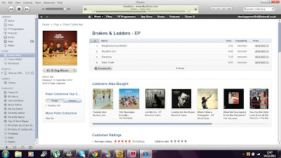
This is the original EP for polar collective, as you can see they are on itunes as a form of advertising and promotion which is the most popular music download station currently. The actual front cover of the EP itself is of a sepia colouration with various miniature toys scattered over a table with the band behind it. The colour of the EP suggests a vintage feel as well as the various props which bring a sense of quirkiness to the front cover. This is important as their target audience will be engaged by this as their audience will be young teens who enjoy indie/pop music therefore something far from mainstream and something more quirky. We have taken inspiration from this for our digipak as we wanted to go for the quirky feel also as well as bringing some vintage aspects to it also, as we know this is what will attract our target audience. However for our own individual front cover we have focused more on Goodwins star image and bringing a sense of vibrancy to it as we wanted it to fully stand out.
 As you can see above we believe we have achieved this look, bringing a sense of quirkiness, colour and simplicity to our digipak. We also believe this will definitely appeal to our target audience as it is some what similar to the original cover however brings a different aspect to it of star image and colour.

This is the original EP for polar collective, as you can see they are on itunes as a form of advertising and promotion which is the most popular music download station currently. The actual front cover of the EP itself is of a sepia colouration with various miniature toys scattered over a table with the band behind it. The colour of the EP suggests a vintage feel as well as the various props which bring a sense of quirkiness to the front cover. This is important as their target audience will be engaged by this as their audience will be young teens who enjoy indie/pop music therefore something far from mainstream and something more quirky. We have taken inspiration from this for our digipak as we wanted to go for the quirky feel also as well as bringing some vintage aspects to it also, as we know this is what will attract our target audience. However for our own individual front cover we have focused more on Goodwins star image and bringing a sense of vibrancy to it as we wanted it to fully stand out.

Thursday, 20 December 2012
Digi Pak Photos;
Yesterday me and sam went to shoot some pictures for our digipak. We had a firm idea in mind of the pictures having a house party feel to them therefore shooting in sams house with some additional props of a guitar, rubber ducks and beer bottles. We chose these specific props as we wanted to really focus on the quirky look we are going for throughout the music video as well as our album cover. We had the key idea of using silly string within our shots and we kept this in mind, and when we covered the guitar in it it achieved a really effective shot, highlighting the party feel that we hope our album will be all about. After editing I watered the pictures down to having 4 really effective ones, the album cover itself, the back cover and 2 other images that I hope to use within the album.
 This is the image we chose for the album cover. As an album cover we thought this shot was really effective as it has been lit rather well, with a 2 point lighting system, it also employs the rule of thirds as well as being a nice photo of sam, enhancing the star image. The ducks are significant within the shot as it brings that quirky feel we were after as well as bringing some vibrant colour to the shot. To edit this shot i used a free editing programme and after playing around with the different functions i came up with this effect. As it has a vintage, polaroid look to it this highlights the quirkiness as well as attracting our target audience as the vintage look is in fashion currently. The font is still in a working progress as it is what we are looking for, something quirky and cartoon like however i believe we could make it stand out even more, and to do this I was thinking about putting the font in seperate boxes, enhancing the animated look as well as making it stand out even more than it does already.

This is the image we constructed and chose for the back of our album. This image really epitomises the house party feel with the rustic guitar covered in silly string with beer bottles staggered over the shot. Like the front cover shot it has been lit from above with 2 lights pointing to the guitar from different directions, this has created a vibrant image with the guitar stickers jumping off the shot in contrast to the wooden floor which gives the shot a 'basement feel' to it. We wanted our album to have a sense of continuity to it therefore i chose the same font for the back cover as well as the front cover. To highlight the text i chose to differentiate between black and white as well as putting a cartoon cloud in the top right hand corner, bringing another aspect of quirkiness to the shot as well as referring to our music video.

This is another shot that we want to include within our digipak,maybe as the inside cover however we are not sure yet. Likewise this picture brings a sense of contuinity to our digipak, linking to the front cover of our shot. What makes this shot so effective is the use of leading lines, the front duck being in complete focus whereas the last duck seems to be a bit blurred, i believe this really works as there is also a hidden duck in the background bringing another element of quirkiness and fun to our digipak. I edited this shot on the same editing programme however used a different effect, which really enhances the vintage look of the shot. I believe this would work as an inside cover as it doesnt have sam in it therefore focusing the audience's attention on the front cover yet it is still a dynamic image which is engaging and quirky.

This is the final image that we chose for our digipak to use as one of the inside shots. It conveys sam as a party animal with silly string thrown all over him as well as his guitar.. also he is holding a beer bottle which highlights the house party feel we were going for. Likewise sam's facial expression is very neutral therefore showing no emotion, which is conventional with young adults, our target audience. We believe our digipak will engage our target audience as it is fun and quirky yet is still made up of effective shots that conveys sam's star image.


This is the image we constructed and chose for the back of our album. This image really epitomises the house party feel with the rustic guitar covered in silly string with beer bottles staggered over the shot. Like the front cover shot it has been lit from above with 2 lights pointing to the guitar from different directions, this has created a vibrant image with the guitar stickers jumping off the shot in contrast to the wooden floor which gives the shot a 'basement feel' to it. We wanted our album to have a sense of continuity to it therefore i chose the same font for the back cover as well as the front cover. To highlight the text i chose to differentiate between black and white as well as putting a cartoon cloud in the top right hand corner, bringing another aspect of quirkiness to the shot as well as referring to our music video.

This is another shot that we want to include within our digipak,maybe as the inside cover however we are not sure yet. Likewise this picture brings a sense of contuinity to our digipak, linking to the front cover of our shot. What makes this shot so effective is the use of leading lines, the front duck being in complete focus whereas the last duck seems to be a bit blurred, i believe this really works as there is also a hidden duck in the background bringing another element of quirkiness and fun to our digipak. I edited this shot on the same editing programme however used a different effect, which really enhances the vintage look of the shot. I believe this would work as an inside cover as it doesnt have sam in it therefore focusing the audience's attention on the front cover yet it is still a dynamic image which is engaging and quirky.

This is the final image that we chose for our digipak to use as one of the inside shots. It conveys sam as a party animal with silly string thrown all over him as well as his guitar.. also he is holding a beer bottle which highlights the house party feel we were going for. Likewise sam's facial expression is very neutral therefore showing no emotion, which is conventional with young adults, our target audience. We believe our digipak will engage our target audience as it is fun and quirky yet is still made up of effective shots that conveys sam's star image.
Tuesday, 18 December 2012
Filming in the Studio:
On tuesday we reviewed our music video and what we needed to do in order to complete our final first draft. We realised that in order to get a wide range of shots and to fill up minor gaps in our video we needed to film more, and we had the idea of filming in a professional studio in order to achieve the performance aspect for our video. We also decided to film a section of our video in a studio as it is conventional for the indie theme as it shows musical raw talent, which is emphasised by the lighting and body language of the artist.
The studio consisted of a dark grey/black screen and we had 2 high key lights pointing towards Sam from both the left and right direction. We did this in order to light up the whole of sam to achieve a flawless image as well as to contrast with the dark screen; we were not sure if this was going to work but when we filmed several shots we realised it did work and did achieve a professional look as well as having a music video feel to it, especially for the indie genre.
Filming in the studio enhances the musically raw element to our music video and therefore engages our target audience, of young/indie adults that appreciate musical talent as well as a quirky twist.
The studio consisted of a dark grey/black screen and we had 2 high key lights pointing towards Sam from both the left and right direction. We did this in order to light up the whole of sam to achieve a flawless image as well as to contrast with the dark screen; we were not sure if this was going to work but when we filmed several shots we realised it did work and did achieve a professional look as well as having a music video feel to it, especially for the indie genre.
Filming in the studio enhances the musically raw element to our music video and therefore engages our target audience, of young/indie adults that appreciate musical talent as well as a quirky twist.
Our Text Editing

We decided to layer up the text in order for it to appear on the screen seperately when each lyric was sung. This was quite time consuming as we had to almost edit it like we would lip syncing, however after we did so, we were so happy with the result as we achieved the perfect timing as well as a clear link between the lyrics and the video.
Tuesday, 11 December 2012
In depth research; Digipak
As we have now decided what images we want to create for our digipak i have down some more in depth research about similar digipak's that i have found online, that contain the same imagery as ours. So a man with a guitar, certain similar locations and mise en scene. The reason for doing this is so i can grasp a better understanding of the conventions within the music industry in which sort of album cover appeals to a certain target audience. Therefore for our particular album we wanted to create a conventional album, a man with his guitar however we want to bring our own quirky twist by using some unique imagery alongside it, for example we are planning on covering our artist and location in silly string which will hopefully create a quirky and dynamic image.
 This is the first album cover that i have analysed in order to get a better understanding of the type of digi pak we want to produce. This is similar to what we want to produce as the main focus of the cover is the artist with his guitar and this is what we want to achieve however we want to employ the rule of thirds to create a better looking shot. Furthermore the constructor of this album has played around with saturation and different colourations, we also want to do this, however we want to desaturate our cover a little bit rather than to create a yellow tone, we want to desaturate ours a little bit in order to create a more moody atmosphere, this will be popular with our target audience as it will have a serious, musical feel to it as well as a quirky twist alongside it.


This is an example i found of an ed sheeran image which is similar to the type of shot we want to create for our digi pak cover. The location is what stands out in terms of what we want to use for our digi pak, Ed is sitting on a bench which is a conventional setting for a songwriters album, as it shows their humility as well as portraying their raw talent through the raw location of a bench. However we want to create a different shot to this one as we want to use the rule of thirds and leading lines to enhance our image further, this will focus our target audience's eyes on to our artist and his guitar, which is ultimately the most important thing.
DigiPak: Focusing on main idea
Throughout the past week we have been brainstorming digi pak ideas and what we want our album to achieve, looks wise in order to engage our target audience. After much deliberation we have decided on a range of shots to include within our digipak. As we are aware this digipak will be to promote an album rather than a single so therefore we have decided to deter from using imagery from our actual music video, rather that we are going to go a completely different route, focusing on sam (the artist) with his guitar. However, althought we want to stick to the generic conventions we also want to add our own quirky twist as the band itself is very quirky and different therefore we want their album to directly portray that.
For the front cover of our digi pak we have come up with an exact image that we want to create. We want to use the rule of thirds alongside a mid-close up with sam sitting on the bench with his guitar. You may say this sounds generic however to add a quirky twist we are going to cover him with silly string, which as i have seen before, creates an engaging and effective image, as the colours stand out as well as the fact sam is with his guitar, highlighting that he is in fact a musician.
 The picture above is an example of the type of image we want to create. The colour saturation is also similar to what we want to create. We want to achieve an engaging look with the multicolours of our silly string however we do not want this to look too vibrant and over the top as we still want to emphasis sam's talent etc. This particular shot has used leading lines which is also what we want to achieve with one of our inside cover shots, as it focuses the stance of the artist with his guitar, portraying how the guitar is almost an extension of himself. This sort of image will engage our target audience as young adults appreciate the talent of playing the guitar, however quirkiness is currently in fashion, and as our album cover is going to portray this we believe our audience will be intrigued by this. As well as this our female audience will be engaged as sam is a male with a guitar which is often a desirable image towards young females.
For the Back cover we want to carry on the guitar theme however we want to mix it up a bit to keep the audience engaged as well as our album cover being coherant and continuous. The shot that we are hoping to capture on Thursday for the back of our album is sam walking away in a rural location with his guitar either on his back of standing up next to him, this emphasises the isolated location, fixating the audiences focus on sam. This image also conveys a literal meaning as the back cover of the album represents the end, and sam is walking away from his audience, emphasising how the album almost has an intimate gig- like feel to it. 0
For the front cover of our digi pak we have come up with an exact image that we want to create. We want to use the rule of thirds alongside a mid-close up with sam sitting on the bench with his guitar. You may say this sounds generic however to add a quirky twist we are going to cover him with silly string, which as i have seen before, creates an engaging and effective image, as the colours stand out as well as the fact sam is with his guitar, highlighting that he is in fact a musician.

For the Back cover we want to carry on the guitar theme however we want to mix it up a bit to keep the audience engaged as well as our album cover being coherant and continuous. The shot that we are hoping to capture on Thursday for the back of our album is sam walking away in a rural location with his guitar either on his back of standing up next to him, this emphasises the isolated location, fixating the audiences focus on sam. This image also conveys a literal meaning as the back cover of the album represents the end, and sam is walking away from his audience, emphasising how the album almost has an intimate gig- like feel to it. 0
Thursday, 6 December 2012
6/12/12 - What we edited today
In today's lesson we uploaded the footage we filmed the other day and unfortunately it worked out that a mistake occured with the camera and none of our footage was what we wanted it to be, therefore we had to set out minds on to something else. However we have planned to re film on tuesday to film more lip syncing , a segment where sam is in the bath and some more scenes which include barbie; such as her doing snow angels in the snow, her sitting on the edge of a wall gazing at sam and her sunbathing.
As our footage was unable to be edited we focused on doing something else that we wanted to include in our video, making our lyrics come up on the screen by using a cool/quirky font. We were not sure how we were originally going to achieve this however after some trials and tribulations we have managed to achieve what we wanted. Originally we were going to use photoshop to create our on screen lyrics however we realised that the same look can be achieved simply by using final cut pro itself. In order to get the font we wanted we went on to dafont.com and scrolled through the 'comic' section as we knew we wanted a 'cartoony' feel to our font/lyrics as this enhances the quirkiness of our video.
 This is the font we chose to use 'que fontita' as we believe this would create the kind of look we were trying to achieve. The exact lyrics that come up whilst using this font is 'you're not dating her' we chose to put this bit of the song in fontasised lyrics as we believed it fully got the message across as well as creating a new dimension to our video.

Subscribe to:
Posts (Atom)